
Web Site Redesign
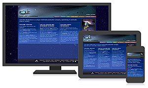 With the advent of smartphones, phablets, and the other mobile accoutrements of modern life online, Loch Ness Productions has redesigned our Web site to be more responsive. It seems that many folks like to look at our Web site on our phones and iPads (and like to show it to others during meetings). While the site looked good, it needed to be maximized for devices beyond the desktop computer. If you look at the rest of our site on your desktop monitor (this blog hasn’t been converted yet), it may not be apparent our design has changed much from before.
The difference is more apparent on your portable device (tablet or smartphone) and we hope we’ve made your browsing experience a lot easier! You shouldn’t have to constantly do the pinch/zoom routine like you used to; our pages now optimize themselves for the size of your device’s screen. Of course, some pages work better in either portrait or landscape mode, but mobile users are used to flipping their devices around.
Moreover, depending on your browser’s viewport size, the navigation menus convert to tap-friendly, single-level dropdowns, from the multi-level “dropdown-on-hover” menus we use for the wide desktop-optimized size. It may take an extra tap or two, but those new responsive menus under the  and
and  icons will still get you where you want to go. (You’ll see them on your monitor too, if you resize your browser window really narrow — try it!)
All this might not seem like a big deal, and some may think we’re latecomers to the party. But it took us several months of (un)doing things in our site’s HTML code. Our previous design used a tables-based layout, not the flowing CSS model of blocks, divs and floats. There were literally tens of thousands of table cells in our 700+ pages sitewide that needed reworking, and tons of explicit font size calls (measured in points, not scalable ems). Oh, there are still plenty of tables today, but far fewer of them are used just for layout. Some actually contain tabular data, like they’re supposed to!
The last major redesign was more than a decade ago, and people have told us how easily they’ve been able to find things on our site. So we kept most things the same, especially for the desktop; the changes are primarily “under the hood”, to accommodate mobile screens. In making the conversion, though, we decided to forego support for legacy browsers (such as Internet Explorer 7 and below) that don’t fully support CSS3, which wasn’t even around when we last tackled site design.
We still have some work remaining, like finding a good responsive WordPress theme for this blog section. Overall, though, the pages come out the way we want on our own hardware. If you’re encountering weirdness when you look at the pages, please let us know!
 Subscribe to our blog!