or, How I Try to Make Customers Happy
I recently completed a project that started out small, but quickly grew to major proportions. It began — as often is the case — with a request from a customer:
“We need a flat-screen trailer for Lars the Little Polar Bear. We have trailers for our other shows running on a TV monitor behind the Admission Desk. People seem to like seeing a minute or two of the show to decide if it’s the right fit for their kids. We want to help people make their planetarium ticket selection.”
A reasonable request, I thought, and a good idea to help promote the show. There was only one problem however: a flat-screen trailer for “Lars” didn’t exist.
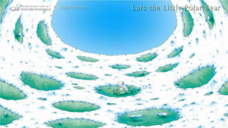
Originally produced by the Mediendom Kiel, our version of the show was created in fisheye dome master form, and that’s all I had to work with. It’s meant to be shown on a dome, of course — display on a TV screen wasn’t exactly what anyone intended when creating the show.
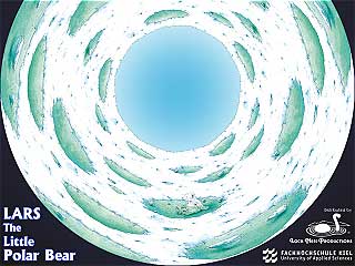 Yes, Loch Ness Productions has always had (and still does have) “flat-screen” versions of all our shows and trailers, on each show’s “Previews” page on our Web site. But these are movies made from fisheye dome masters. They’re in this form on our Web site because our intent is primarily for planetarians to preview them to help aid their purchasing decisions. Most fulldomers are used to seeing shows as circles on monitors — but not so much the general public. And, our Flash previews are only 320×240 pixels, so they load really fast in your browser.
This request actually got me started on a project we’d long had on our “to-do” list. Our Web movies are Flash FLVs, and the Apple overlords have deemed that Flash files aren’t worth supporting on their devices. So you couldn’t see our previews on your iPad or iPhone. At first, we didn’t think that would be much of a problem; most customers wouldn’t be shopping for shows via a Web site in their browser on an iPhone. But, more and more we found people simply wanted to show them to others in social discussions, or as “demo” views in conference room presentations, and such — sometimes using their iDevices to feed external displays, for example.
But we couldn’t abandon the Flash previews altogether. Just a few days ago I was talking to a customer whose school district’s nanny filter blocks all YouTube videos. He could still see our previews on our Flash pages — a good reason to keep them!
However, putting all our previews on YouTube solves the accessibility issue for iDevices. YouTube can deliver transcoded videos for a myriad of devices that request them. But, it would entail quite a bit of work on our part to get our entire catalog of videos ready to upload.
An HD 1080p 16:9 video should make for a better-looking trailer preview, even after YouTube compresses the bejeebers out of it. A “flat-screen” version might make more sense to the casual viewer, compared to the circular dome master — especially being on YouTube, which would certainly have the potential of providing plenty of casual non-planetarian viewers from around the world.
Ever willing to please, I set out to make new trailers that could be
- shown on an HD TV screen, and
- something we could post on YouTube.
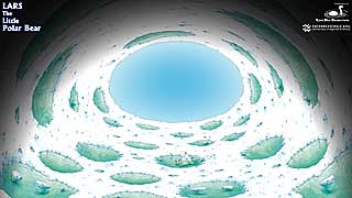 Step one was to convert the existing trailers from fisheye to something more rectilinear. It turns out that the warp needed for movies formatted for spherical mirror systems takes the fisheye’s circular horizon and flattens it nicely. The resulting frame looks just like a planetarium dome view, on a flat screen.
How convenient. All our trailers already exist in spherical-mirror warped versions. Using IMGWarper for Windows, I had already made 1920×1080 warped frames from their fisheye counterparts. So it was a matter of loading all those frames from their storage drives onto our server.
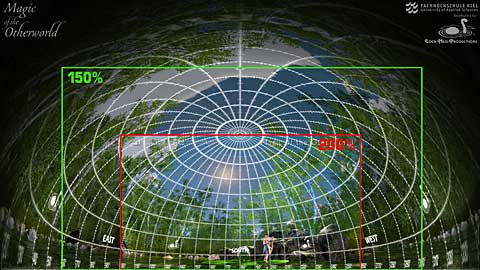
Now, viewing the entire warped dome full of imagery in a TV frame isn’t exactly what I needed. There is a “sweet spot” at theater front where most of any show’s action takes place, just as there is a “safe area” in most TV screen productions. (The majority of fulldome theaters are front-facing, and almost all fulldome movies are.) In a warped frame, the sweet spot is front and center. So if we zoom in to the sweet spot, putting the horizon on the bottom of the frame, we get the least amount of dome curvature in our imagery, while zeroing in on the action. Or so the thinking goes.
So into After Effects I went, creating compositions 1920x1080px, since that would be my final output size, and putting the warped frames as source material into their own layers. Since our source material was also 1920×1080, to “zoom in” meant scaling the layer up in size to fill our 16:9 rectangle with the sweet spot. That meant the imagery softened some from the upscaling. I compensated by adding a Sharpen adjustment layer.
But it turned out that the amount of scaling had to change from trailer to trailer, and sometimes within the same trailer, depending on the content. If something important happened outside the sweet spot, say at the zenith, I needed to be “zoomed back” enough to be able to see it up at the top of the screen. Conversely, some onscreen texts were too small to be easily seen, and I would have to “zoom” even farther in, just so they would be legible. The optimal scaling ended up somewhere between 150% to 200%.
Then, there was the onscreen “branding” issue.
 One of the benefits of buying shows from Loch Ness Productions is that when we ship shows, we usually include a bonus: as many trailers as will fit on the media. They’re already formatted for dome display on the customer’s system, at its native full resolution. Sometimes there can be dozens of trailers, and it can sometimes be difficult remembering which one is which. So with distributed trailers, we put an onscreen identifier on them — the name of the show to the left, on the horizon at 90 degrees (East), and the logos of the producer and distributor on the opposite side, 270 degrees West, all at 50% transparency so as not to detract too much from the rest of the dome display.
For the new HD trailers, though, those East/West identifiers wouldn’t work — they would be outside of the sweet spot and wouldn’t be seen at all, or worse, would appear partially, cut off on the edges. And they’re pretty curvy and hard to read in any event in a spherical mirror warp. That parent in the queue at the Admission Desk needs a real TV-style caption identifying what it is they’re watching.
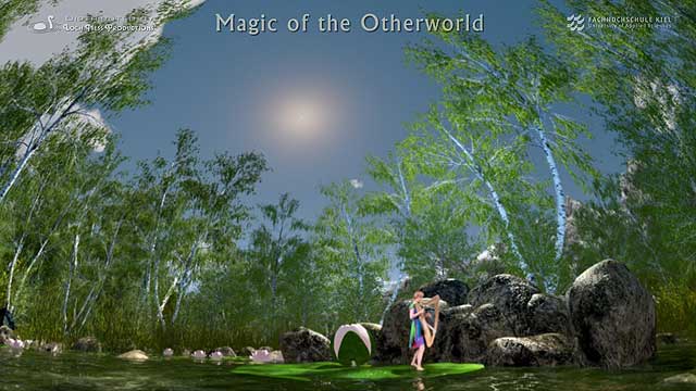 Creating the flat-screen branding was easy enough — text layers and logos. But, unfortunately for me, I’d made all the warped trailer frames from their branded fisheye counterparts. Unbranded warped trailer frames didn’t exist. So I had to go back to the original source frames and recreate non-branded fisheye frames, from which I could create non-branded warped frames, which I could then use as source material when making the HD trailers, just so I could rebrand them. For more than 36 shows, this was a major amount of work! It took me days to accomplish.
Okay, so I finally had all the 16:9 trailers as compositions in After Effects, ready to render. So… what do I render? Well, I really had two different targets — 1920×1080 HD movies for display on video screens in museum lobbies, and YouTube. I rendered the “Lars” trailer first, an H.264 MP4 as the customer originally requested. They were happy, and it looked good to me on my workstation monitors.
Then, I uploaded it to YouTube. Yuck. By the time it got through their compression and processing (and YouTube’s whining about it not being “optimized” for what they wanted to see, but it still was accepted) the thing was way too dark. You could hardly see stars, and that was at full HD resolution. Scaled down to the 640×360 size their viewer would use in our Web pages, there were NO stars visible at all, and just a hint of a Milky Way. Colors looked muddy and dull too.
So I added more adjustment layers — additional sharpening, more color saturation, and a nudge up on the black level to something more equivalent to the old 7% black pedestal of analog TV days. I did various tests and redos. Eventually I came up with something that seemed to work okay. Big areas of white tended to wash out (like Lars in the snow fields), but the stars needed all the help they could get otherwise. All the sharpening added a thin brighter edge around the frame, but not too objectionable, I thought.
OK, so then I had to make two renders for every trailer (and each one took 30-60 minutes to render), a “normal” HD MP4 for TV, and a juiced one for YouTube. Then I thought, “you know, I better render out 1920×1080 frames in addition to the movies, in case I need to make different format HD movies in the future, and those shouldn’t have the YouTube workaround adjustments.”
That meant I had to make that three renders for every trailer. More days.
YouTube automatically creates thumbnails from uploaded movies, grabbing out frames based, I guess, on some algorithm of something it thinks should be representative. But our fulldome shows have a lot of starfields in them, and those tend to have a lot of black — which, to the non-aware algorithm, got interpreted as underexposed. So YouTube boosted the hell out of the levels and colors and the resulting thumbnails were so garish they were unusable.
So I had to go back into each project and capture good “glamor” thumbnail frames, and upload those separately, and tell YouTube to use those custom thumbnails instead of the ones it had come up with.
All that was for the trailers.
 In this “grand migration to YouTube” project, I also had all our full-length show previews to upload as well. Each of our show previews have 4 segments, so that was 144 8-10 minute videos to upload. I did not make HD/flat-screen versions of these. Mirabile dictu! YouTube accepted the existing FLVs we have on our Website without complaint.
Once uploaded, then playlists for all these had to be created, so you can view the whole show with one mouse click, instead of having to select each individual segment.
All these videos needed to have descriptive text and tags and keywords and such for their YouTube pages, since in YouTube’s viewer you can click through to view them on YouTube. We can’t count on people seeing them only using the embedded viewer on our own Web pages. Fortunately, Carolyn handled the bulk of that part of the project; words are her milieu, after all.
Then there was all the HTML to create for the new Previews Web pages. Now every show has two — the default page with the YouTube viewers and URLs for the trailers and playlists, the other our rewritten Flash pages, with reciprocal links to each other.
It was a lot of work. Days stretched into weeks.
One upside of this project: now that HD versions of the trailers exist, we can include them in our fulldome show packages as an additional benefit for our customers. Maybe not everyone will have an immediate need for them — but since this whole project came about because of a customer request, I’m guessing the need is already there.
Another upside to this project — with all the trailer frames from all the various shows loaded onto the server, I could tear into the After Effects project for our showreel montage, “Three Minute Blast!”, and update it to include recent catalog additions. We now have a Four Minute Blast! And an HD version of our original One Minute Blast! as well.
The project is now done and you can see the evidence by clicking “Watch it!” on each show’s page. You’ll get a choice of trailers and whole show viewing options, all delivered up by YouTube, or Flash from our own Web site. Check it all out, and let us know how it works for you.


One Response to Flattening the Dome